Field Notes2019-09-12Balancing Natural Beauty with a Clear Path to Conversion

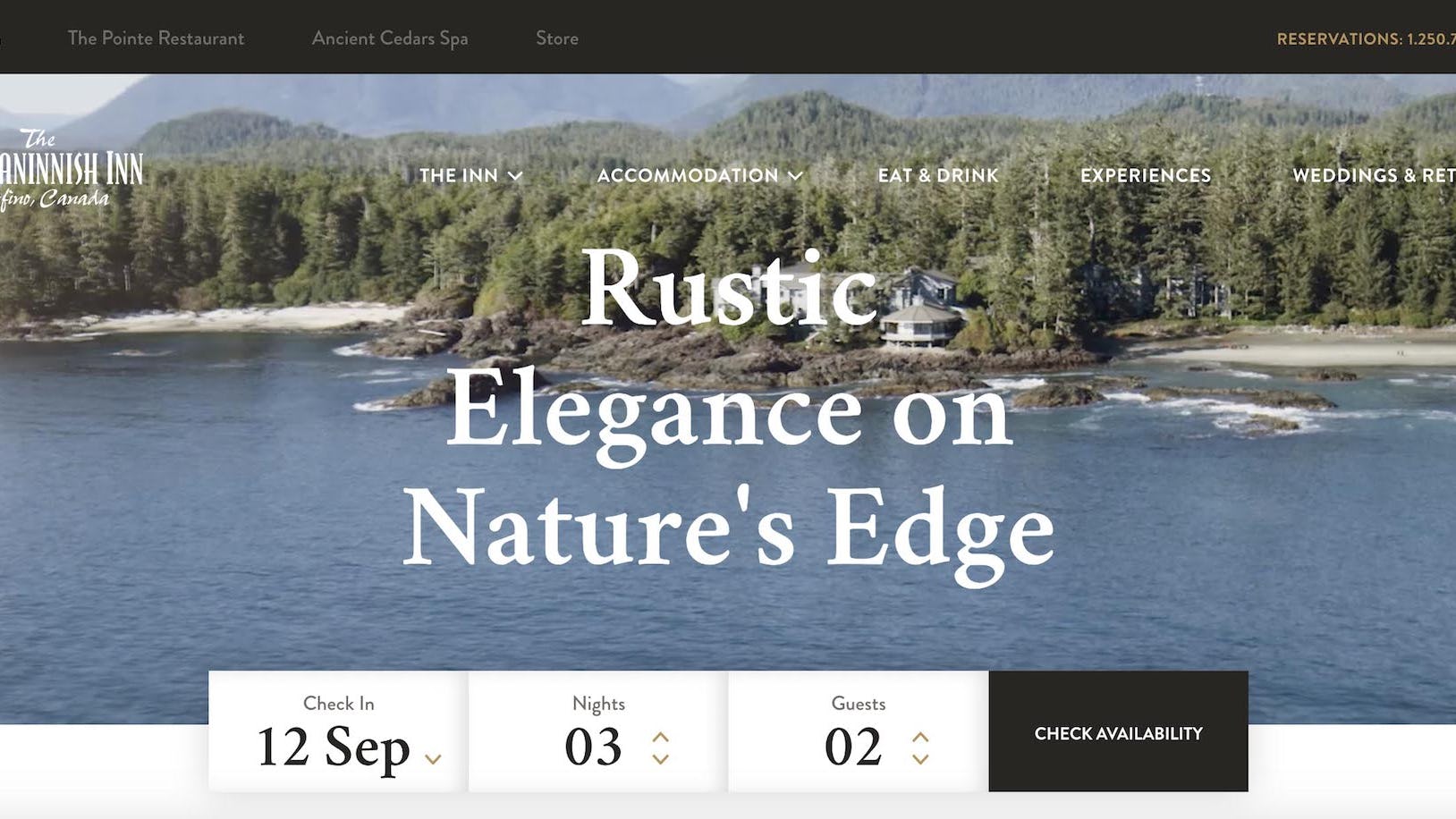
Behind the build: The Wickaninnish Inn website
In 2012, we designed and launched the Wickaninnish Inn’s website. Over the last seven years, VentureWeb supported the website with routine maintenance, security updates, mobile upgrades, UX improvements and booking engine enhancements. Web standards began to outpace the improvements, however, and it was time to completely overhaul the website.
The new Wickaninnish site is built on the Processwire CMS. Processwire is a powerful, open-source CMS that we have used to complete a number of other client sites, most notably The Pointe Restaurant (the Inn’s restaurant) and Backcountry Snowcats.
Delivering a frictionless user experience
User experience, on both mobile and desktop, was the lightning rod that guided the design of this new website. All of the elements of the site, from the typography, colours and the overall user interface were designed to sit quietly on the page to complement the Inn’s understated elegance and sophistication.
We achieved this level of subtlety and nuance by employing the CSS grid system - a solution that has been in production for a number of years, but only recently saw wide browser support. The system allows the designer and developers to arrange site content in a grid workflow and adjust the number of columns per page on the fly, rather than being constrained to a 12 or 16-column layout throughout the site. The result is engaging pages with layouts that perfectly complement the content.

Immersing the user in a relatable experience
The Wick identified that they needed to better engage visitors at the dreaming/consideration phase of the booking process. With this new iteration of the website, they did so by telling stories about the resort. The Wickaninnish History page reads like an abridged history of Vancouver Island, and the experiences page is littered with fantastic itineraries for the diverse range of guests that may arrive on the Wick website.
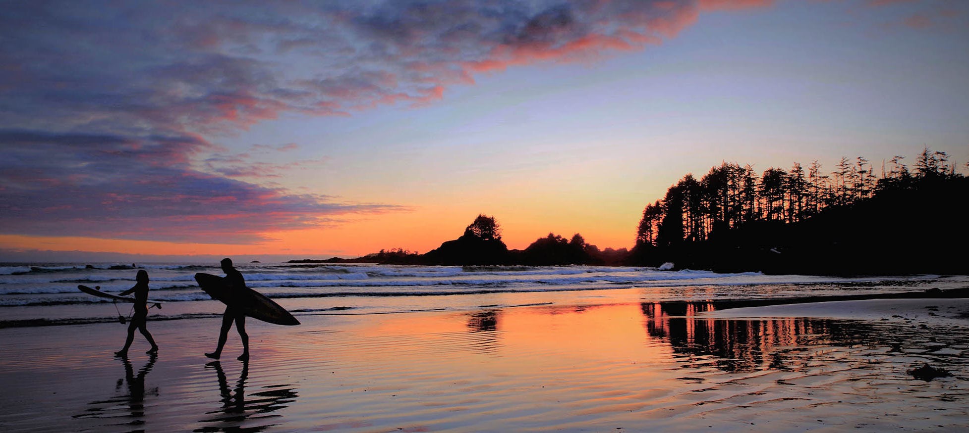
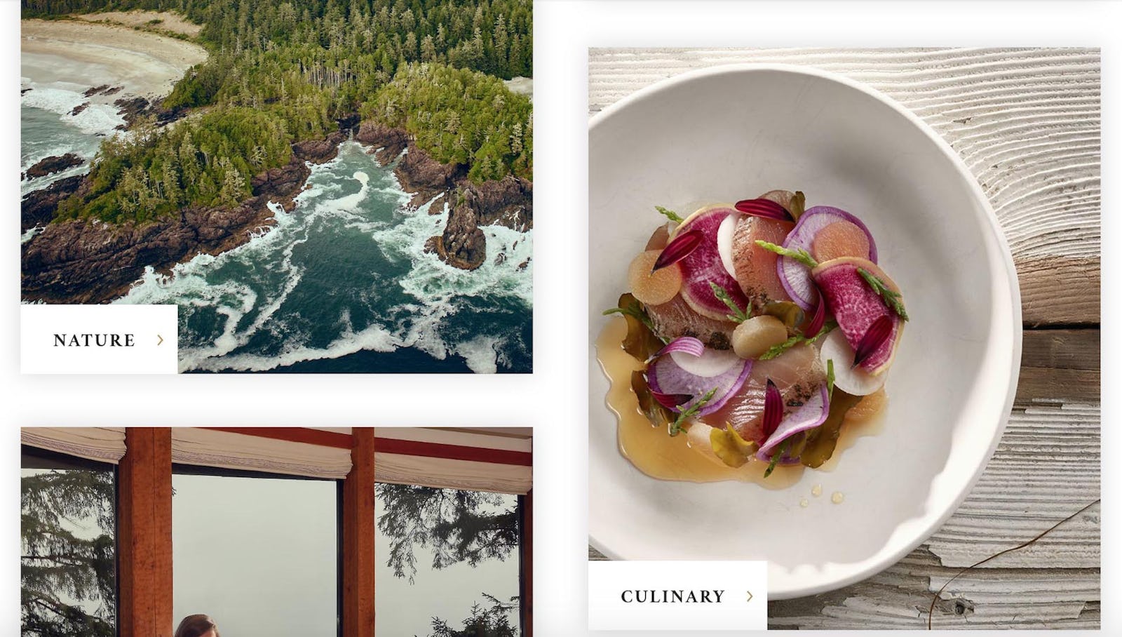
Harnessing the power of a great image
The previous iteration of the Wick site was very copy-heavy. This is common for a 7-year-old website. Our discovery phase identified this challenge which was remedied during the design/wireframing phase of the project. The result is a website in which the imagery is the primary storyteller, and the copy exists only to provide necessary context.

Exceptional content that is a resource to guests & visitors alike
Tofino is a destination unique in its offerings. Weather can turn on a dime, and a slight dampness in the air is omnipresent. As such, the Wick’s packing list is distinct. In an ongoing effort to provide the most value to potential visitors and in-destination guests, a packing list page is prominently featured as a CTA on the site. Besides that CTA is a “getting here” card which is crucial for a location that requires (in some cases) both a ferry and plane ride to arrive to.
The suggested itineraries also serve the dual purpose of inspiring both would-be visitors to visit Tofino, and Inn guests to get out and explore the area. The itineraries have been carefully considered, and align with the diverse range of guests that may find themselves at the Wick.
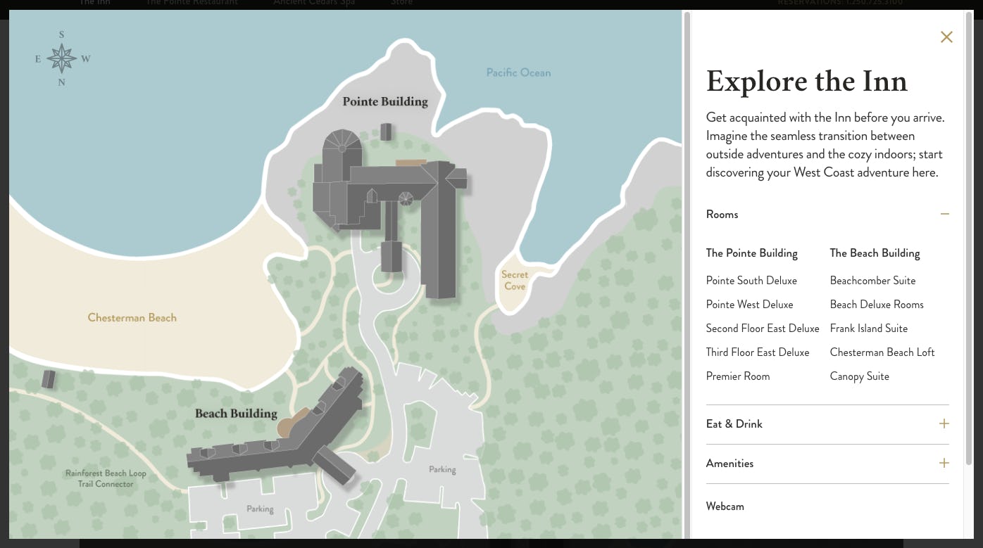
Allowing the user to explore
The Wick is a property with a diverse set of offerings. From a carving shed that houses an artist in residence, to The Pointe Restaurant. That’s why we built an interactive map that allows the user to hover over different parts of the property and gain information about each location in real-time. No click-to-compare here. Those property sections seamlessly integrate with the CMS, allowing the Wick’s content managers control over what is displayed on the map as necessary, depending on seasonality and availability.

Conversion. Sans the hard sell
All of the inspiring copy, interactive elements and beautiful photos would be for nought if the booking experience did not align with the inspirational content. We struck a balance between a strong presence of booking and availability CTAs, without dipping into an overtly sales-focussed conversion strategy. Ultimately, the job of the website is to encourage users to book a stay at the Wick. Rather than inundating the user with that message, we let the content speak for itself and placed opportunities for conversion strategically to meet the user in their journey to booking.
We needed to provide balanced information that would allow the user enough detail to book confidently for themselves. For example, a key question that sales agents navigate is explaining the differences between the Point and Beach buildings and their commensurate experiences. We provided navigation, content, and an interactive resort map to help inform our users how to choose a suite that aligns with their interests.
The VentureWeb team brought to the table their experience and deep understanding of the luxury resort space. Their invaluable insights helped make the launch of our new website a massive success.
The infamous nav bar
The website navigation and specifically the top-level navigation proved an interesting challenge in designing this site. The Wick wanted to incorporate all three of their properties into the nav bar in some way. The properties included the Wick itself, the Ancient Cedars Spa (which is on the same domain) and the Pointe Restaurant (which is on a different domain). Of course, the navigation mainstays needed to be there as well, including accommodation, food and drink page, weddings and groups, and experiences.
Our solution was to create two navigation bars. The topmost features the three properties, and disappears as the user scrolls, only to reappear once the user scrolls back up the page. The main nav for the Wick site is larger upon loading up a page, but it animates to shrink when the user scrolls so that the content displays front-and-centre. On top of all of this, subtle animations were included to seamlessly integrate the (rather large) navigation bar with the site content as the user scrolls the page.

And so to conclude…
Presenting emotional and engaging content on a website is one of the best strategies to endear a user to your brand. We feel that we have done an excellent job of balancing the desire for inspiring content with the pragmatic need for functionality and a seamless user experience. We hope that new users to the website enjoy browsing it just as much as we did building it. Here’s to the Wick’s upcoming storm season (booking storm, that is).